Thursday, 11 February 2010

Profile portraits

In the past months I have painted two profile portraits from models.
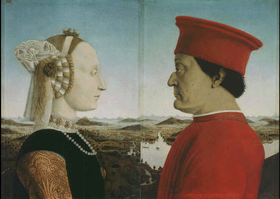
I originally felt like trying a profile after looking at renaissance profiles, not only Piero's famous Federico da Montefeltro and Battista Sforza, but also paintings by Pollaiolo and Piero di Cosimo.
        Recently a drawing of a girl in profile was attributed to Leonardo by analyzing a fingerprint found on the paper. It doesn't seem a Leonardo to me but definitely the image has stuck to my memory.

       So why the profile? My first thought is that painting a profile switches the attention away from the personality of the sitter, and denies the viewer the psychological reading that many people look for.  The model is looking away and the viewer is not compelled to look at her in the eyes. The attention is shifted to the model's features and to the composition of the painting.


This portrait of Clelia was painted in two sittings. I had done a first attempt during a previous sitting but I didn't find it interesting and have now destroyed it. This second one is more carefully planned and designed.
What I tried to do was incorporate a rigorous geometric construction underneath the painting. I think it gives the portrait a calm elegance and a strong balance.
Here are the lines I have used to establish the placement of the head and shoulders. You have to take my word that despite the straightening and idealizing of some lines the resemblance with the model is still there !


        The landscape format allows for more space behind and in front of her, some space to breathe.
The axis of the composition is the diagonal from the top left corner to the bottom right, that passes through her cheekbone. I then considered the two lines that form an x on the right of the painting: they both go from the corner to the middle of the length. Both sides of her shirt align with one of these lines, while her back and her hairline align with the other. 
        The back of her neck is completely vertical and she is placed as in a pyramid, with her forehead parallel to the line on the left. The overall design is made more gentle by a series of curves: her throat, her right shoulder and the hairdo. 


The second profile is also painted with an awareness of geometry, but the paint application is allowed more freedom. It was done over one sitting on a small board.


The tip of her nose is placed halfway down the height, while again the axis of the composition is the top left to bottom right diagonal, to which the hair is parallel. The horizontal line that divides the part of the hair which is lit ( grey) from the part directly facing me ( black) is placed at a third of the height.
I have tried, while painting, to make the back of the head turn on the horizontal line on the middle but it just didn't look right anatomically.


Anyway I am satisfied with both works and I hope this post might offer a different and interesting way to look at a painting.

Thursday, 10 December 2009

Sargy Mann at Cadogan Galleries


This is the second time I go to see a show of Sargy Mann works. I first approached his work through the paintings of his wife from a show I saw two years ago, pictures I couldn't stop looking at, and slowly made my way through his landscapes.
Especially after reading his son's book on him and seeing his development over the years I am absolutely enthralled by this artist. What I find extraordinary is the way he can actually suck you into his paintings. When I look at his pictures, especially large landscapes, I find myself suddenly right in the spot where it was painted.
I have been thinking about why this happens, and I believe it is because they represent the sensation of "being there" more than the spectacle of the scene, and communicate this sensation to the viewer. Visually they are very much structured spherically, following the way the artist can/cannot see what surrounds him.
Generally the painters I admire the most are dealing with the problem of representation, the subject matter becoming secondary or incidental.
Mann's work is definitely about looking. With time what started as short-sightedness and astigmatism has become cataract and ultimately led to a corneal transplant. Mann is totally blind since 2005. He has always been a painter and always will be, and he is still producing the great works. His brushwork is confident and furiously fast, his colours like music.

At the beginning of his book there is a portrait done in 1963, when he had good eyesight, strikingly similar to one of his latest paintings of his wife from 2007.


Perhaps it is the effort to perceive the reality around him that makes his paintings so strong. "Seeing is subjective, you see in your brain, and I always saw at my best when I was painting", says Mann.
He is really one of those artists who is able to enhance our everyday life, the way we look at the reality around us.

Interviews and reviews:

The Times

The Spectator
The book Sargy Mann: probably the best blind painter in Peckham is also available on Amazon and I can't recommended it enough.

Friday, 4 December 2009

Alex Kanevsky show in London

Now, is there anyone interested in painting that hasn't visited Alex Kanevski's website ?
Alex is a lithuanian painter based in Philadelphia. I have been fascinated by his work ever since I stumbled upon it on internet years ago.
During my most recent virtual visit I realized that some of his works are in London, of all places, at Victor Felix Gallery in Notting Hill.


I just went to see the show this afternoon and wasn't disappointed. They had two paintings on Mylar, L.G. 4 and L.G. with sprained ankle. Actually I was disappointed because I would have liked to see twenty of them. You never get tired to look at these works.


There are a lot of pictures on Kanevsky's website including interesting slide shows which reveal his working method ( no secret, he's just plain good at it) and links to interviews.

Wednesday, 14 October 2009

Following Piero della Francesca/2


With a little delay this post is about the last day of my summer trip.
Urbino is fabulous. We went for a walk in the evening and found out that Palazzo Ducale opened in the morning at 8.30 so the next day were the first visitors, and the guards were opening each rooms as we came in.
What an experience to be alone with the paintings. There are two masterpieces by Piero in Urbino, and they share the same room.


The Madonna di Senigallia was a complete surprise for me, I think I overlooked it while browsing through Piero's paintings.
It's elegance and balance are stunning.
The draping, jewels and the little basket on the upper right corner are all executed with chilling realism, while the heads are idealized and pure. I feel that this painting is visually very much about the position of the heads and their relative size.
I spent a long time staring at it and taking in its vertical and horizontal rhythm, the chiaroscuro barely hinted at, the perfection of the simple blue and red colour scheme.


"La Flagellazione" is one of the most famous paintings of Piero, and it's size is quite a surprise, only 58x81 cm. Small size for an immense work. Enough has been said about it's elusive meaning. Standing in front of this work as a painter I was wondering what it was I was connecting with.
I think that the absence of strong passion, of movement is what I liked. The flagellation is stilled in mid air, Christ is just looking at his torturer, the man in the black hand is making a gesture as if to quiet the action.
This perfect harmony of stillness is something I always found appealing in painting. The composition here is so perfect that it is impossible the action will ever begin again, that time would re-start.
Is it the use of geometry and mathematics that imparts this sublime balance to the painting? Does the regular rhythm of the darks help, or the simple three values scheme?
These are all elements I will have to remember when I work.

PS: Sir Charles Locke Eastlake opted not to buy the painting for Queen Victoria in 1858 because of some features which offended his taste, notably the thick ankles !

Thursday, 24 September 2009

Lynn Painter-Stainers Prize 2009

The list of selected paintings has just been published. I scroll down... and here's my name !
I am so happy to have made the selection again. Every time that I take part into juried shows it's an agony. One brings his works at the venue and you find yourself in a queue. This year the place where the selection took place was a large hall in Kensington. I arrived on the morning of the first day: paintings were placed on the floor all along the walls, and my pictures were already in the third row.
Looking at the list of entries I can't fail to notice that the numbers go up to 1195.
I was confident about the work I submitted, but there is always a doubt on whether the judges will take the time to look carefully, come close, really close. Among more than a thousand works will they spot my rather small portrait?
It seems like they did this time, but still I think that it is not fair for one's own painting to throw them in the arena like this, and I will only take part to one juried show next year.
Please do take the time to look closely at the painting by visiting my website page and clicking on the picture for a high resolution image.

Wednesday, 16 September 2009

Following Piero della Francesca/detour

From Sansepolcro we headed toward Citta' di Castello, further down along the Tiber valley. There isn't any painting by Piero there, but two interesting museums devoted to Alberto Burri.
Burri is a painter and sculptor who died in 1995. Originally a physician who took part in WW II, he started to paint during his time as a POW in the States.
His paintings were made with different materials of which he highlighted the qualities.


He sewed and painted on raw canvas, he etched and combusted wood, ignited cellophane etc. In the series "Cretti" he explored the texture of dry clay grounds.


The latest works have a smooth surface and are more about design and interaction of shapes and colours.


Burri has two dedicated museums in Citta' di Castello. One is in town housed in the historical Palazzo Albizzini.
The Albizzini family had a dedicated chapel in the church of San Francesco. It is here where the Sposalizio della Vergine by Raffaello was originally located. Raffaello's painting is now in the core room of the Accademia di Brera in Milan, where it hangs literally side to side with Piero's Madonna and Child with Saints ( I was there earlier this year).


The first museum holds a selection of pieces by Burri displayed chronologically.
The most striking place to visit though is the second center belonging to the Fondazione Burri. The building is a former tobacco drying plant. I think it is the largest space ever dedicated to a single artist in the world: 7500 sqm, it is simply huge. A part was given to Burri for free in 1978, and it is now completely occupied by his work.
His paintings, seen in the monumental and austere industrial setting, acquire an impressive status and a strong spirituality.


Somehow the visit to Burri's museums fit in with Piero. His geometry, his attention to the design and partition of the canvas, his earthy colours, golds and vivid reds resonate of Piero's works.

Next stop, Urbino.

Wednesday, 9 September 2009

Following Piero della Francesca


This summer I had the chance to go on a two days trip to see Piero's works. Many of them are condensed in a small area in the center of Italy, around his birthplace, Sansepolcro.
I started from Arezzo, where I visited the frescos from the Legend of the Cross and the Santa Maria Maddalena in the Duomo.


I love this small fresco, and since I first saw it I always thought she is a very good depiction of modern Italy. There's the beauty, that special italian light and the melancholic feeling when we remember of what our nation was and could have been if it wasn't inhabited by so may hopelessly inadequate people. Not to speak about Maddalena's former job.


After Arezzo we went to Monterchi, birthplace of Piero's mother, where we admired the Madonna del Parto. After the ambitious monumentality of the frescos this tender and smaller work set in the tiniest village is heart breaking. I love the recycling of the cartoon: use it once, then turn it round and trace the other angel ! Oh, and remember to shift the colours. It's so wonderfully naive and yet the result is elegant and balanced.


The next stop was Sansepolcro, a small town at the bottom of the Tiber valley. Piero's house is here ( it now houses a foundation in his name). Luca Pacioli, an important mathematician, was also born here. Piero was his first teacher.

"The majority of the second volume of Pacioli's Summa de arithmetica, geometria, proportioni et proportionalita was a slightly rewritten version of one of Piero della Francesca's works. The third volume of Pacioli's De divina proportione was an Italian translation of Piero della Francesca's Latin writings On [the] Five Regular Solids. In neither case, did Pacioli include an attribution to Piero. He was severely criticized for this and accused of plagiarism by sixteenth-century art historian and biographer Giorgio Vasari. R. Emmett Taylor (1889–1956) said that Pacioli may have had nothing to do with the translated volume De divina proportione, and that it may just have been appended to his work. However, no such defence can be presented concerning the inclusion of Piero della Francesca's material in Pacioli's Summa."


In the Museo Civico of Sansepolcro I saw four works by Pietro. The Polittico della Madonna, San Giuliano, San Lodovico and the Resurrection. There also is the polyptic in which the National Gallery's Baptism of Christ was originally placed.
I cannot say how many layers the Resurrection is made of. The composition, the expression of Christ, the landscape. It is a painting you can watch for ever and find new meanings every time.
The philosopher Massimo Cacciari wrote a short essay on it where he makes some very deep consideration. He points out how there is a division between the divine world and the mortal world, crammed with the soldiers' figures. There is no reference to death in this painting, but nothing points to life either. The land is hard, no flowers or signs of spring, but a land on which foundations can be laid. Christ is logos, his name has to be spoken with sobriety, with clarity of design, a purity of form and a direct, unflinching look. Christ is alone, he is wearing the red cloak of victory, but seems ready to take on other burdens. Never has the Verbum been preached more strongly than by this silent figure, says Cacciari.

In the next post my travel continues to Urbino and Perugia, passing by Citta' di Castello.